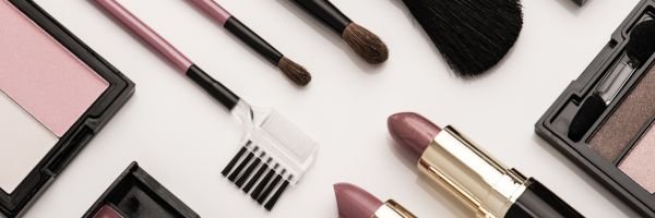
Launching a beauty line is exciting—but nothing is more disappointing than finally seeing your products in hand only to realize your logo doesn’t look the way you envisioned. Maybe it’s too small, overly detailed, or the colors don’t translate well on the packaging.
At Radical Cosmetics, we understand how important your branding is. That’s why we’ll soon be offering in-house logo printing services, along with an on-site graphic designer to guide you through the process. From file setup to design adjustments, we’ll ensure your logo prints beautifully on every product—whether it’s a lip gloss, compact, or skincare jar.
Here are five key best practices to make sure your logo is always print-ready:
1. Keep It Simple: Design with Print in Mind
Your logo should be clean, bold, and easy to recognize. Overly intricate designs can lose clarity when printed on small products like lip pencils or mascara tubes.
- Use thicker lines and strong shapes.
- Avoid unnecessary detail that may blur or fade at smaller sizes.
- Remember: the simpler the design, the more professional it looks across all product types.
2. Scalability: Make Sure Your Logo Works at Any Size
Beauty products range in size, and your logo needs to scale with them. A logo that looks great on a large jar may disappear on a slim eyeliner pencil.
- Avoid thin lines that can vanish when reduced.
- Choose bold fonts that stay legible on even the smallest components.
- Use solid graphics—they reproduce much more clearly than intricate outlines.
3. Color Choices: Think About Backgrounds
Packaging comes in different materials, textures, and shades. Your logo should maintain its impact no matter the background.
- Test your design against light and dark surfaces.
- Avoid tricky color pairings (like gold on coral or purple on hot pink) that reduce readability.
- Stick to solid colors over gradients for timeless, versatile results.
💡 Pro Tip from Radical: Black-and-white logos are often the most versatile and professional choice across product lines.
4. Save and Export Correctly
When it comes to printing, file type matters.
- Always save your logo as a vector file (.ai, .eps, .svg). Vectors can be scaled infinitely without losing quality.
- Avoid relying on raster formats (.jpg, .png), which can pixelate when resized.
- Prepare multiple logo variations (horizontal, vertical, square) so you’re ready for any packaging style.
- Remove unnecessary whitespace to keep your logo placement precise.
5. Know Your Printing Options
When it’s time to bring your logo to life, you’ll have a couple of methods to choose from:
- Direct Printing – Provides a durable, professional finish that looks seamless on packaging.
- Labels or Stickers – A cost-effective solution, though often less premium in appearance.
Radical will soon be offering direct logo printing in-house, giving you more flexibility and control. And with our graphic designer available on-site, you’ll have expert support to answer your questions and make adjustments before production begins.
The Bottom Line
Your logo is the centerpiece of your brand identity—it deserves to shine. By keeping your design simple, scalable, and versatile, and by using the right file formats, you’ll ensure your products look as polished as the formulas inside them.
At Radical Cosmetics, we’re here to make the process even easier. With upcoming printing services and direct access to our graphic design expert, you’ll be able to transform your logo into packaging that’s as professional as your brand.